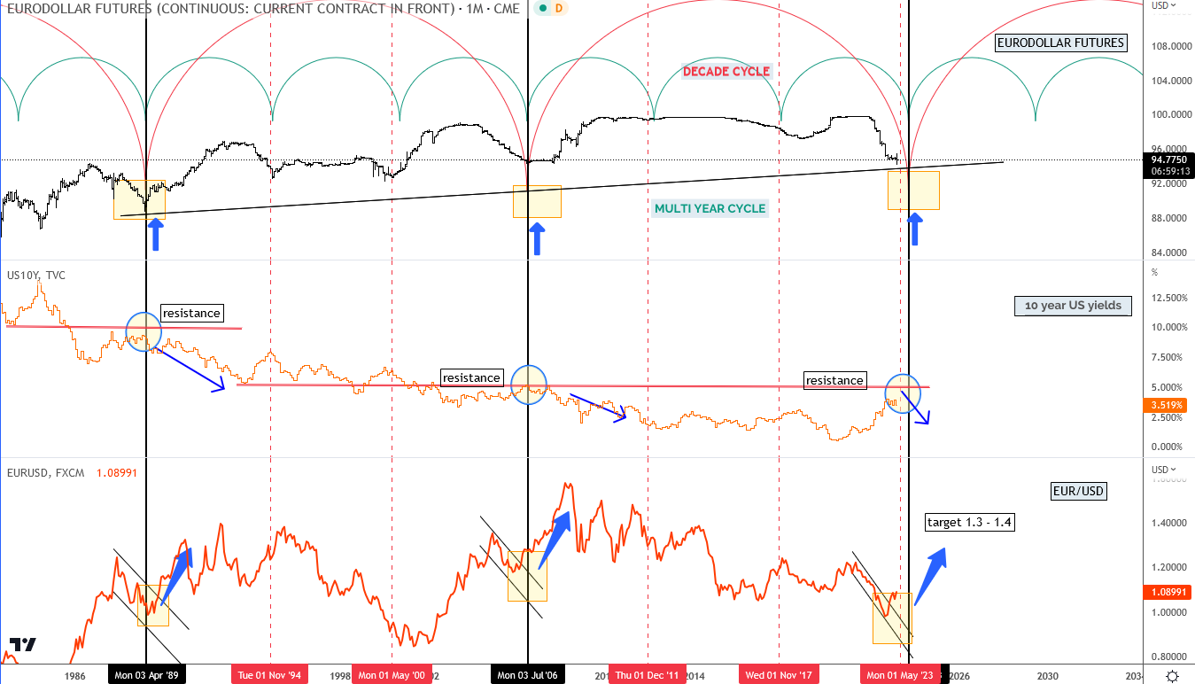
Let’s look at it through the eyes of an investor. Let’s think he brought $30 million into the fund. Every few months he gets a report or document that looks like it was done by a 12-year-old child. Careless. Done poorly. What kind of message does the investor get from this?
At the very least, it is a show of disrespect.
Of course, everyone will say that what matters most is results. That’s obvious. The result will always be king, no doubt.
But let’s think of a situation when a fund has a weaker quarter or even a weaker year. And let’s think about the question whether these poor documents will help to keep the client or not?
When everything is OK and results are fine then a poorly prepared document is unlikely to be a problem. But in the case of a weak quarter, such things may begin to sting.
And the effort put in, the time, money, dinners and gifts can go to waste by having a weaker result presented in a weak, messy, sloppy document.
The second, equally important issue is new investors. Potential investors or their representatives are bound to read maybe dozens of old reports back to back. I think everyone does that.
What will they find in them? What image of the company will emerge from the content and the form? Will the company be seen as professionals or as amateurs?
It’s a really sad situation when the next document in a row contains basic communication errors, has a font that is too small, charts that are too small (a large proportion of people today read on tablets and even phones).
Those who print reports for themselves the old-fashioned way usually find the margins and top and sides cut off. Such a printout is unreadable and only fit for the round archive.
Some of the reports and letters give a bad impression. Carelessness. Lack of attention to form. Cheapness.
Over the past year I have read maybe 30 Goldman-Sachs reports. They are flawless, even exemplary. Someone there is certainly making sure the client doesn’t get anything lousy. This is a good example, worth following.
What does a Bentley or Maserati catalog look like? Is it superbly prepared graphically and editorially, or does it look like a collection of text and photos thrown into a word processor and turned into a pdf? Fund investors are used to the Bentley level so the gap is huge.